SETTING THE SEA'NE
- pascale arminjon-taylor

- Feb 24, 2019
- 14 min read
Updated: Jun 23, 2019

CONTINUALLY FAVOURING starkness when building housing developments, whether it be social housing or luxury villas, building en masse, with investment and budget as the key factors to the finish, equates to a formula of repetition. the design is often consistent, and i don't use this as a positive. the interiors i often feel to be based on archaic ideas of how one should live and the only differentiation in 'quality' are the materials used in the finish. though, this is at times equally a false perception, as I have visited countless 'luxury apartments' and been aghast at the workmanship and cheap finish. cutting corners with repro and look-a-like materials dominate both ends of the market, so in truth i have reserved faith in the mass building industry
from an interior design point of view there are always irritations to overcome, for example, developer's thoughtless placement of fixtures and fittings, choice of finish, layouts plagued with some odd space, wall return, ledge, that creates an awkward obstacle. at times, a perfect white box would be a preferable blank canvas to work with. my issue, is these spaces are to eventually become homes for individual people with a unique style and this strips that from us from the start. especially for those renting, most likely to move homes more often, so should benefit primarily from a well considered interior layout and freedom to decorate. granted not everyone is as preoccupied with this sentiment, but i write for the audience that enjoys creating a home and i bare no judgement on those happy to live in whatever they have been sold
living in the middle east where new builds are born almost on a daily basis i am in the midst of this debacle. there don't even seem to be enough people for all these vacuous towers of mediocre build. often marketed falsely to the aspiring home-seeker, they sell what they think we want, using flamboyant text and glossy virtual images, delivering temporary refuge as these are not structures to last a lifetime. i beg of the world to reduce new building and instead invest in renovating what is already decomposing. surely it is another example of wasting resources and i suspect this constant building must be quite environmentally damaging ... though we rarely hear this debate...! could the millions poured into the next tower block not be better spent regenerating crumbling suburbs or old towns? this, alas, falls into the complex subject of preservation, which i have recently been learning about as Bahrain tackles the succession of it's souq, is riddled with vast legislative, bureaucratic, sociopolitical and economic discourse that allows for nothing to happen in haste
at the most basic level i feel we are a society that will take whatever we are given {said 'advertised'} perhaps we have forgotten that we can also live with less. so give us less and we will learn to live with less... maybe, but this is only my opinion. I did recently read a quip regarding the plastic problem, 'if a tap was over-running and flooding a room we wouldn't just grab endless mops to solve the problem, we would turn off the tap!'

that said a revolution has begun and we are taking action towards becoming a more mindful, respectful, conscious, proactive society. i discussed this with my husband recently and concluded that what we view as luxury, aspirational and elevating needs to reconsidered. it is, as i see it, moving from attaining the latest material possession to instead aspiring for a better quality of life, and design has it's hands in both realms. design aspires to be innovative, exciting, forward thinking. yet design should also be familiar, comforting, problem solving, affordable and all inclusive. it will also never please everyone!
PROJECT SEA VIEW has many of the above conundrums. it is part of an ambitious ocean front development at the very south of the island of Bahrain. built on repurposed land in the form of petals fanning out into a perfect aqua sea. the development comprises of an array of investment villa options. these are not meant as permanent homes but most certainly weekend getaways. the architecture is basic with an unintentional nod to Miami Art Deco style. on some streets there is an effort to lift the white panorama with a few villas painted in seaside pastels, mostly blues, greys and sands. against tropical landscaping and an endless blue horizon of calm seas there is a serene air of holiday. the villas have been constructed in a familiar budget wary fashion, basic concrete forms, fronted with aluminum glazed sliding doors and an abundance of stainless steel and ceramic tile finishes. granted the extreme desert conditions are very challenging, humidity is fierce on top of the eroding nature of the sea air, factors that really prohibit longevity of build from the start

on entering the property, which was already in the process of being redecorated, i am met with some very bold colour choices. great big purple sofas sit against a lime green backdrop, amidst a mish mash of clashing contemporary pieces of furniture and accessories. my immediate reaction was this is not an environment to escape to and relax in, but then this may not have been the previous brief...


MY BRIEF was to create a serene space to receive the family at weekends. something effortless to look after and comfortable to use with some luxe and wow moments to impress guests, after all this is the middle east! here are my mood and scheme boards in response to this brief. the budget for this project was conservative which determined the level of sourcing. as much as possible was to be sourced in Bahrain, essentially to keep the process moving forward as quickly as possible, but this would also certainly limit choice. i am always adamant to show that good design is not budget led. as an interior designer my remit is to submit a coherent scheme to any budget, working with what is available, and Bahrain has plenty to offer


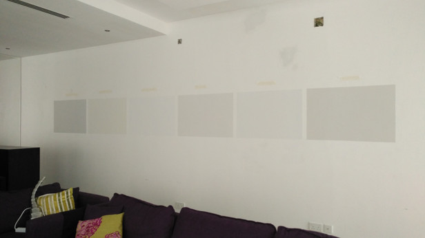
STEP ONE was to white wash those bold colours out so we had a fresh canvas to work with. i selected a variety of 'whites' and the contractors painted the best ever set of colour samples on the wall for me to come in and make the final selection! this was done in every room, so we could assess which tone worked best in the light. we opted for a warm and chalky white to be used throughout the whole property


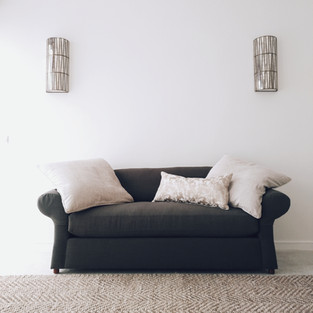
when i start to work on the furnishing i first assess what can be salvaged and repurposed. starting with the main living room, the family loved the sofas so far as they were well built, comfortable and they fit the space, so rather than replace, we recovered


the existing coffee table lent itself to a moment of coastal inspiration with it's white washed wood surface and the dimensions also worked with the existing sofas. i loved the contemporary black metal frame of the armchairs so these also stayed and just needed recovering in a more classic fabric. to this ensemble we grounded the area with a chunky wool and jute mix rug, this made the space feel cosy and tied the palette of grey, blue and sand together


for the floor to ceiling windows and doors that slide open to reveal the sea view we installed, what is becoming a signature moment for me, drapery matched to the wall colour. we opted for japanese style sheer panels that concertina back, diffusing the sunlight without obstructing the sea view. with so much window to cover i didn't want to create a great band of colour to one side of the room. the panels instead cocoon the space in a soft sensual light when closed

to complete the space we added minimal new additions in the form of side tables, lamps, art and a cascading shell chandelier, which made both a statement and is relevant to the coastal location. finished off with some sparse coffee table styling and great big grey linen floor cushions, this area embodies the brief beautifully. side note on the linen floor cushions - these had originally been made for the sofas but when we installed the piece they felt too oppressive and bulky - see pic below. a bit of quick thinking on my part, let's pile them on the floor adding to the casual lounge vibe!


ENTERTAINING is a way of life here. fridays are all about gathering the family together, spending time catching up and feasting! the open plan layout of the kitchen, dining and living area needed to accommodate these occasions. with a large footprint to hand we replaced the dining table and chairs with a generous size chevron top timber table, aligned with brass framed, taupe linen chairs. timeless and comfortable. the drum pendant adds a luxe moment with its gilded arabesque cage detail and the form compliments the shell chandelier within the open plan space

it was delightful to have room to include a dining cabinet. with nothing off the shelf to deliver the dimensions required to make this piece fit for purpose and maximise the space available, i had the opportunity to have this locally custom made. i kept the design streamlined in form as the size was already imposing, opted for a white washed veneer to link in with the coffee table, creating a shared story in the open space. the upper half is glazed to lessen the bulky feel of this piece and display wares. finished off with stark solid metal handles painted in an antique brass colour. standing proud at the far end of the dining area, this piece completes the dining story, makes a statement and is practical

THE KITCHEN was allocated the least redecoration, partially due to budget. however we made a few minor updates, which made major improvements! the first was the removal of the floating counter {i really hate these!} this made for a more practical, user-friendly surface area and feels welcoming and sociable whichever side of the counter you find yourself. we dropped 2 modern globe pendants above the counter for a bit of flair and changed out the stainless steel blinds for a white wood option. the dark wood finish was an inevitable keep. we mirrored this in other pieces within the dining and living area to maintain a coherent scheme and i think this adds a sartorial contrast to the all white interior


THE ENTRANCE of the villa opens into a double height space with indoor juliet balcony overlooking the hallway from the master bedroom. the space needed dressing and though personally i would have kept this quite sparse the client wished for an entrance with a casual wow moment to welcome guests
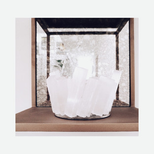
immediately on the left we posed a mid-century inspired grey velvet bench below a custom collection of foxed mirror backed display boxes. within these are an array of textural tealight holders that are both beautiful objets in the daylight and then offer magical reflections of candlelight at night. a very simple idea but when repeated en masse creates a memorable moment and sets the mood of this home from the start


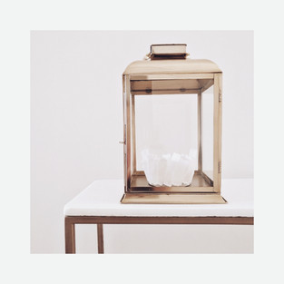
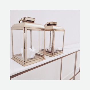
as you walk through the hall, my intention was to make the most of the high wall space available and suggested we make an impact with a large scale mirror, to connect the void between the high ceilings and the ground floor. we custom made a hallway console as the space could accommodate a longer than average piece and I wanted to imbue the wow factor by playing with the scale of the intended pieces. our furniture maker managed to supply a 2.2m length of marble which was the very most we could achieve in one piece, otherwise this would have had to be done in 2 pieces with a join. detail on custom pieces is essential, especially when the design is simplified. the sweeping marble top is what gives this piece the luxury fingerprint. the exposed edges were smoothed over but left raw as i believe in celebrating natural materials used. for the base we opted for a simple metal structure, industrial in design but painted in an antique gold for subtle opulence. we accessorized with brass lanterns filled with welcoming scented candles and large eye catching parrot portraits for some colour to draw the eye upwards. finally, reflected in the mirror are resin coral wall sculptures that bring in texture and interest to this otherwise bare wall, with subtle coastal charm


THE SNUG was our final room on the ground floor. an empty shell that had once been a bedroom, but now opened up to provide an additional seating area to the ground floor. the brief for this room was to be a more formal area for receiving guests, but as it opens out onto the pool it also needed to be practical in it's finish


our first challenge with this space is it had a history of rising damp coming up through the floor and therefore anything laid on top would eventually crack and lift. my solution was to go bold and have a poured cement floor. this would combat the rising damp issue and would add a contemporary edge to the overall design! the {adult} kids loved this idea but weren't so sure I'd convince their parents... i was confident however that as it would solve a problem and in the long run save them on repairs, that it was an intelligent solution and this would win them over. in addition we assured them a white cement finish to blend in with the existing tiles that meet at the rooms parameter and of course a huge rug would essentially cover the majority of the space, therefore you would only notice a minimal amount of this contemporary concrete floor. yes, this did the trick and though we had a few trying times with the contractor on getting the correct finish, it is most definitely one of my favourite flourishes in the villa!


with the floor finished, wet trades dry and electric fixes complete we could start bringing in the furniture. the scheme for this room took on a darker palette, in part due to the fact that the original fabric we wanted to recover the sofa in was no longer available. i was intent on using a washed linen and my only viable option at the time was a dark grey. i loved the drama of this contrasting moment and it mirrored the dark wood moment of the kitchen within the main living / dining area, from which this was room was across from

the sofa itself had been repurposed from the family's main home and as you can see below the transformation is spectacular! to go from chintz to chic we removed the back cushions to allow for more depth to the seating, we swapped the 2 seat cushions out for a sleek bench cushion and tight upholstered the body to show off the traditional lines of the sofa but with a clean modern finish. to this we added a couple oversized cushions and a pop of pattern within the bolster cushion


if there is one thing i am really good at it's finding solutions to challenges and often they turn out better then an original idea. challenges are a constant in this line of work and you have to pick and choose your battles. this little room presented a few! another dilemma was in the hanging of the wall lights. i had marked the location of where they were to hang as i may not be on site the day the builders ran the cables. as it happens i was not there and points for the the lights were chased too high. to lower the lights would have meant re-chasing the cables, creating a new hole and having to make good the first spot, all unwelcome additional costs to the client. so we left them in place and i made a feature of this by filling the awkward void with vintage shell prints and centered the mirror to this

the snug is an eclectic story. we have modern, mid-century modern, traditional, coastal, vintage, all cohabiting. but it works because the tones and textures compliment each other. i continued the use of mix metals into this room, seen within the black bases of the side tables, the bronze of the coffee table, the antique brass of the little side table, swivel chair bases & console, the deep bronze of the mirror frame & wall lights and the stainless steel of the pendant. seems extreme when listed but they harmonize because they are tonally in tune. the remaining pieces are softer and paler in contrast. i created a conscious play on monochrome, combining drama with coherence, which satisfies the eye


THE MASTER BEDROOM was the final space we delivered. a vast area with balcony looking out to sea. my mood for this room was one of softness and simplicity, as seen in my original mood and scheme boards below


the palette was originally composed from our surroundings of ocean blues and desert sands, accented with classic oriental pieces. however, a pair of must-keep chairs made their way into this room and changed the vibe slightly, for the better in my opinion. the client asked to re-purpose some existing ornate armchairs in the style of Louis XV. though reproduction pieces they still had a beautiful integrity in their form and carved detail. i wanted to uphold a sense of authenticity and suggested recovering them in a pale blue & brown toile that also complimented the original palette

with this pair now dominating the design in the room, we kept the remaining pieces as neutral as possible but eclectic in styles. throughout i've aimed at including subtle middle eastern moments, as we did here with the bed and its arabesque headboard

the desk and vanity evoke the clean lines of mid-century modern design which opposes the arm chairs with elegance

the glass and mirror bedside tables have an art deco spirit in their design, paired with glass and gold lamps to bring a moment of luxe into the room. a cosy wool and jute mix rug, in as large an off the shelf size we could acquire, defines the space and brings warmth to the tiled floor

with a room of this scale we could allow for a hotel style seating area in front of the balcony doors, a space to sit before the view and relish in a book or mindful moment. the chairs were a fortunate inexpensive purchase, as this room had the least amount of budget allocated to it. the smart button detailing and contrast piped edging, in addition to being in an ideal fabric, made them feel essential to the finished space. completed with the client's existing nest of side tables and few ornate vases


i'm particularly pleased with one element that resulted in the real transformation to this space. we had a dividing wall that housed built-in wardrobes and was a rather boring structure. previously it had been wallpapered, with purpose, as this hid the unsightly gaps of the wardrobe construction. my original plan was to keep this white and hang a magnificent mirror above the table to create the vanity area. after a few reflective {!} moments in the room, on a day where we had the balcony doors wide open, i had a light bulb moment. if we clad the partition in mirror it would achieve a multitude of magnificent things! it would flood the room with additional light, reflected from the opposite wall of windows, as well as the sea view which would now be seen from both sides when lying in bed! heaven! furthermore i would no longer need a mirror for the vanity, and it added a higher spec finish to the room. an idea, i've been told, inspired some house owners in Australia to do the same! good design should not only solve problems, but also enhance and elevate the original piece


to the reverse side of the partition we made a very simple update and changed the existing steel handles to delicate ceramic and brass cupboard knobs, which i doubled up at each point to actually cover the 2 holes created by the previous handles, but i love the chic and simple statement this abundance also created!

ART FEATURES throughout the images above, the finishing statement to any room and i thought it worth making this a specific mention. with a conservative budget this calls for some imagination and compromise to the type of art you can afford to include. for the most part we purchased prints, such as the ready framed parrots in the hallway and large magnolia in the snug. for this room i also used some of my own palm frond photographs to add a gallery moment in the little corridor. the coral fans hanging in the master bedroom we downloaded and had locally framed. we also re-framed some of the clients existing pieces such as the vintage nautical prints in the master bedroom


THIS COMPLETES the redecoration of #projectseaview! i know all along you have probably been wondering where is this sea view as it appears in no photos! the next phase for this project will be the outdoor area. at the time of photographing the project the unfinished exterior would not have been favourable to the finished interior and therefore i focused on the interior views only. i've had to rely on taking my own photos as i have no budget to hire a professional photographer at this stage, who would potentially have had the expertise to capture this. but this is the reality of still being a small but growing business. i make the most of what i can achieve and aim for better with each and every opportunity!
it has been an utter joy working on this project, with clients who have been wholeheartedly committed to my vision and confident in trusting my design. completing a project you know your client loves is my most important goal!

GRATEFUL also to the ongoing support of Arabian Homes who featured #projectseaview in their February 2019 issue and selected it for the cover! all in all #prouddesigner
see the full feature here


Comments